DH150-UX
Community of Travelers and Adventure-Seekers
DH150 Assignment01: Heuristic Evaluation by Priyana Patel
The community that I feel I belong to is a community that seeks adventure, travels to new places, spends time with friends and family, and never feels settled in one place. I feel a close association with this community because as an immigrant from the United Kingdom, I call multiple places home. This community is a group of people with long, drawn-out network ties in multiple cities, countries, and continents looking to explore.
App #1: Expedia
https://www.expedia.com/app
The app that I chose to best represent this community is Expedia. Expedia users can be lone travelers, friends or families looking to get away, or business travelers. Expedia is an online travel agency that can be used to book flights, hotels, car rentals, cruises, and bundle deals.
Overall, I feel that Expedia provides a relatively straightforward, step-by-step process to plan the user’s trip, however the app poses confusion for new users that may be unfamiliar with common travel terms. There is not a lot of available help, documentation and solutions for inexperienced users. The main UX issues I found that can be improved are: too much text/overcrowding on the page, too much scrolling, and confusion with fine print details such as baggage fees, layovers, check-in age, etc.

App #2: Southwest
https://www.southwest.com/html/air/products/mobile.html
The second app I chose to reflect users of this community is the Southwest app. Southwest users can also be lone travelers, friends or families booking vacations, and business travelers. Most importantly, Southwest users are those who may be booking last minute flights, seeking flexibility and budget prices. Southwest is a mobile platform and extension of the American airline company which allows users to book flights, check-in, change existing reservations, as well as check flight status, boarding position, and gate information.
Overall, Southwest allows the user to access pertinent, real-time information regarding their flight that they would otherwise have to ask in-person to Southwest personnel. The main UX issues that I found that can be improved are: too much text, too many access points, and unnecessary promotional images that distract first-time users from the main goal of the app.
1: Visibility of system status
Expedia
Shows each step everytime the page loads (step 1: select hotel, step 2: select outbound flight, step 3: select inbound flight)
Severity rating: 1
Why: The user is only able to see their progress when they are in-between steps and the next page is loading.
Southwest
Shows the users if they are logged in on the left sidebar menu, with rapid rewards number and rewards points
Users are aware when they are selecting their departing/returning flight, but there is no progress bar until after flights are selected
Severity rating: 1
Why: Users are relatively aware of their progress in the site despite a few inconsistencies.
2: Match between system and the real world
Expedia
Good use of icons, such as luggage, buildings, cruise boats, planes, etc.
Hotel search results are positioned on a map with price points, allowing the user to view accomodations in terms of proximity to their destination.
Severity rating: 1
Why: Expedia does a satisfactory job of using language that the user can understand and implementing icons that match the real world.
Southwest
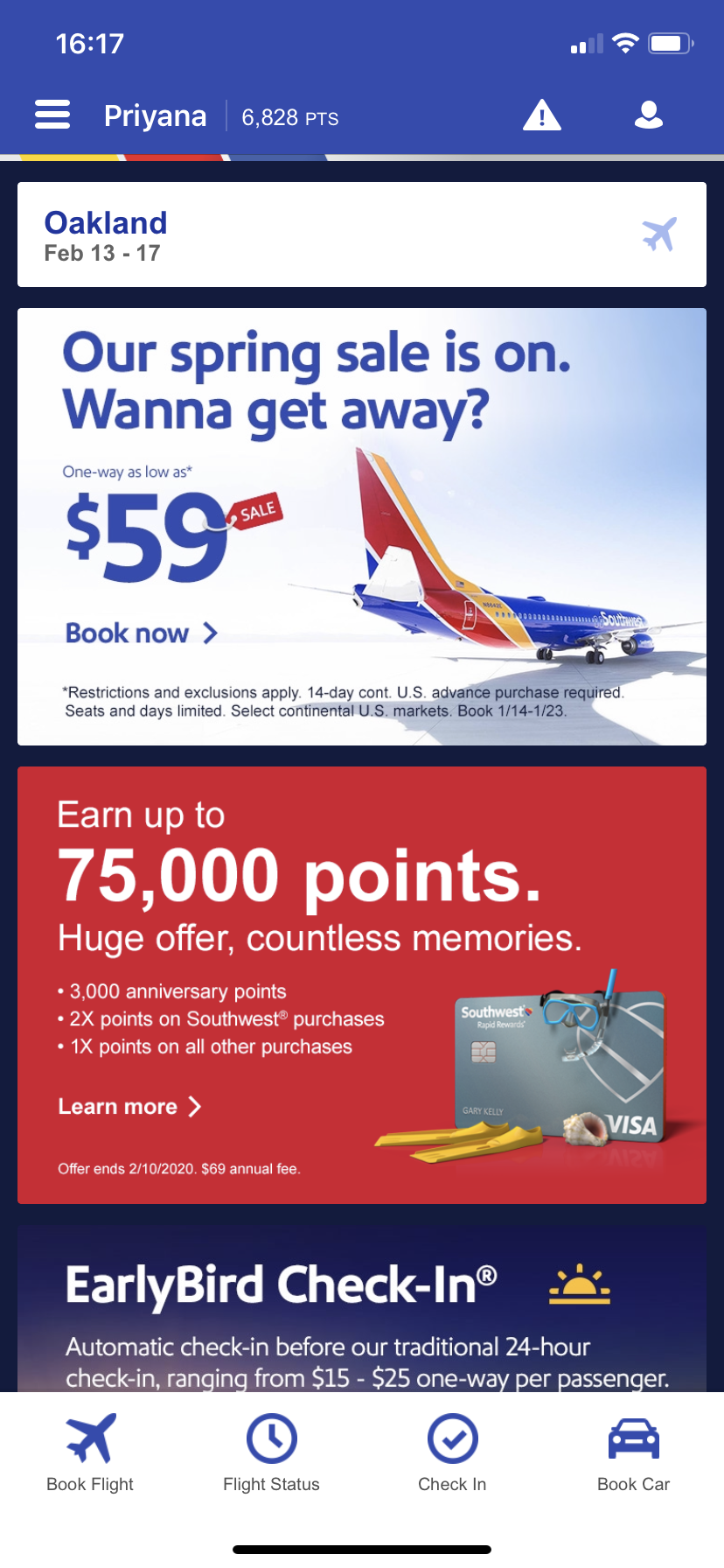
The app uses familiar and conversational language, such as “Our spring sale is on. Wanna get away?”
Severity rating: 1
Why: Southwest speaks the user’s language, using consistent and familiar terminology.
3: User control and freedom
Expedia
There is an upper pulldown bar that the user can access to edit the search field
Once on the final checkout page, the user has to keep clicking the back arrow if they want to change one leg of the flight
The user is only able to book airline tickets for a maximum of 6 people, limiting how many people they can book for their travel needs (not ideal for large groups)
Hotel reviews cannot be filtered out by “helpful”, “critical” as on the desktop site
Severity rating: 2
Why: There are a few restrictions on user freedom that limit how much information is visible to the user, however, they do not severely prevent the user as they go through each step to the final checkout page.
Southwest
A user has to press the back button if they would like to change the airport city, passenger number, or dates of their search at any time
Severity rating: 2
Why: The user has a lot of control while navigating through the app however there are inconsistencies in freedom and control that disrupt task flow, such as booking a flight.
4: Consistency and standards
Expedia
Text or icons in blue are actionable items, red items are used when a feature is not available (non-refundable), green items are used when a feature is available (free cancellation)
The flight search field is almost the exact same as the bundle search field, creating ambiguity
Severity rating: 1
Why: Expedia does a satsifactory job of using consistent colors for actionable items and feature availability; it is clear for the user which items on the page to click on to continue the flow.
Southwest
The app uses colors such as red when flights are delayed, green when flights are on time, and blue for actionable items
Severity rating: 1
Why: Southwest does a satsifactory job of creating a consistent environment for the user, where similar colors mean similar things.
5: Error prevention
Expedia
Once on the overview page before checkout, if a user tries to exit, a warning message appears asking if they would like to start a new search (reminding them that their current package will be cleared)
In the search field, there is no message for the user if they forget to fill out a field, such as “Flying to”; the search button remains unhighlighted
Severity rating: 2
Why: Expedia does a satsifactory job of preventing errors in the user flow, however, it is easy for the user to be unaware of what they are doing wrong if they fill out the search field incorrectly.
.png)
Southwest
An error message appears if a user misspells their reservation number when attempting to check-in to their flight
Severity rating: 1
Why: Southwest does a satisfactory job of displaying error messages with helpful steps and tips
6: Recognition rather than recall
Exedia
The menu bar has a list of options that the user can search for, allowing the user to recognize which service they are looking for
The most recent search field is saved, however there is no “search history” for all searches
Severity rating: 2
Why: While previous locations and dates from the search field are saved, the user is forced to remember a particular package (i.e. hotel name, flight no.) if they left the page at a previous time
Southwest
There is a collapsible sidebar menu that gives the user the option to book a flight, car, hotel or vacation package without having to remember what they would like to do in the app
Previous searches, such as airport cities, are not saved in the search field for future use
Severity rating: 1
Why: Users are given numerous icons and access points based on their travel needs
7: Flexibility and efficiency of use
Expedia
For flight searches, the user has to select their class preference, limiting their ability to see options for multiple classes at the same time
To book a cruise, the user is directed from the app to the desktop site
The user does not have an option to save their search result for later viewing
Severity rating: 2
Why: There are minor issues that disrupt the user flow, however, information such as class preference are explained in more detail at the checkout page (harder to overcome for inexperienced users).
Southwest
To book a hotel or car rental, the user is directed from the app to the desktop website
There are multiple access points for the user to view their profile (profile icon, name, collapsible sidebar menu) creating ambiguity
Severity rating: 2
Why: With number icons and text to access the same thing, a user may be unsure of which to select, causing confusion and wasting time
8: Aesthetic and minimalistic design
Expedia
There are a lot of rated features and disclaimer information on the guest reviews section for hotels, making it difficult for the user to sort through meaningful ratings of a particular hotel
There is an overload of information under each hotel (location, room option, features/amenities, fees, policies, and taxes); it is hard for users to discern the main things to know such as tourist taxes, minimum check-in age, etc.
Severity rating: 2
Why: While there is minimal and sufficient information in the first few pages of the search results, the abundance of information on the following pages causes users to miss crucial information and limits task efficiency
Southwest
There is an overload of promotional offers, such as signing up for the travel credit card, as well as images on the homepage that distracts the user
Severity rating: 2
Why: Inconsistencies in design and layout create less efficient task flows for the user.
Southwest
On the homepage, there are a lot of upsells and promotional offers that take away from the main goal of the app: to book a flight
Severity rating: 2
Why: Promotional offers are more relevant for loyal customers rather than first time travelers, preventing them from exploring the app further.
9: Help users recognize, diagnose, and recover from errors
Expedia
If a user mispells a destination, a dropdown list of destinations appear and they must click one of those to proceed
Severity rating: 2
Why: The app does not provide details on how the user can solve or rectify their mistake; they are left to figure it out on their own
Southwest
The user is reminded to turn on location services to speed up their services and airport experience, providing adequate reasoning and a more comfortable and efficent app experience later on
There is no warning message if a user tries to select nonsensical dates, such as the 14th to the 12th
Severity rating: 2
Why: Southwest does a satisfactory job of preventing errors, however, there are not a lot of warning messages for users to recognize errors.
10: Help and documentation
Expedia
Not being sure which airport to pick when typing in a city for a flight
Information icons for flight class and baggage fees appear after a flight is selected (not before the user fills out the search field)
Severity rating: 2
Why: While Expedia provides help in a timely manner during the selection process, there are a lot of details that are unclear when a user is first entering their search.
heuristic-10(1) heuristic-10(2)
.png)
Southwest
If a user is not logged in, they receive a reminder to do so or sign up as rapid rewards members; they are reminded of the benefits of enrolling in the program as opposed to checking out as a guest
There is a table comparing the benefits between A-List and A-List Preferred
Severity rating: 1
Why: There is satisfactory information that explains certain guidelines when the user is in the booking process